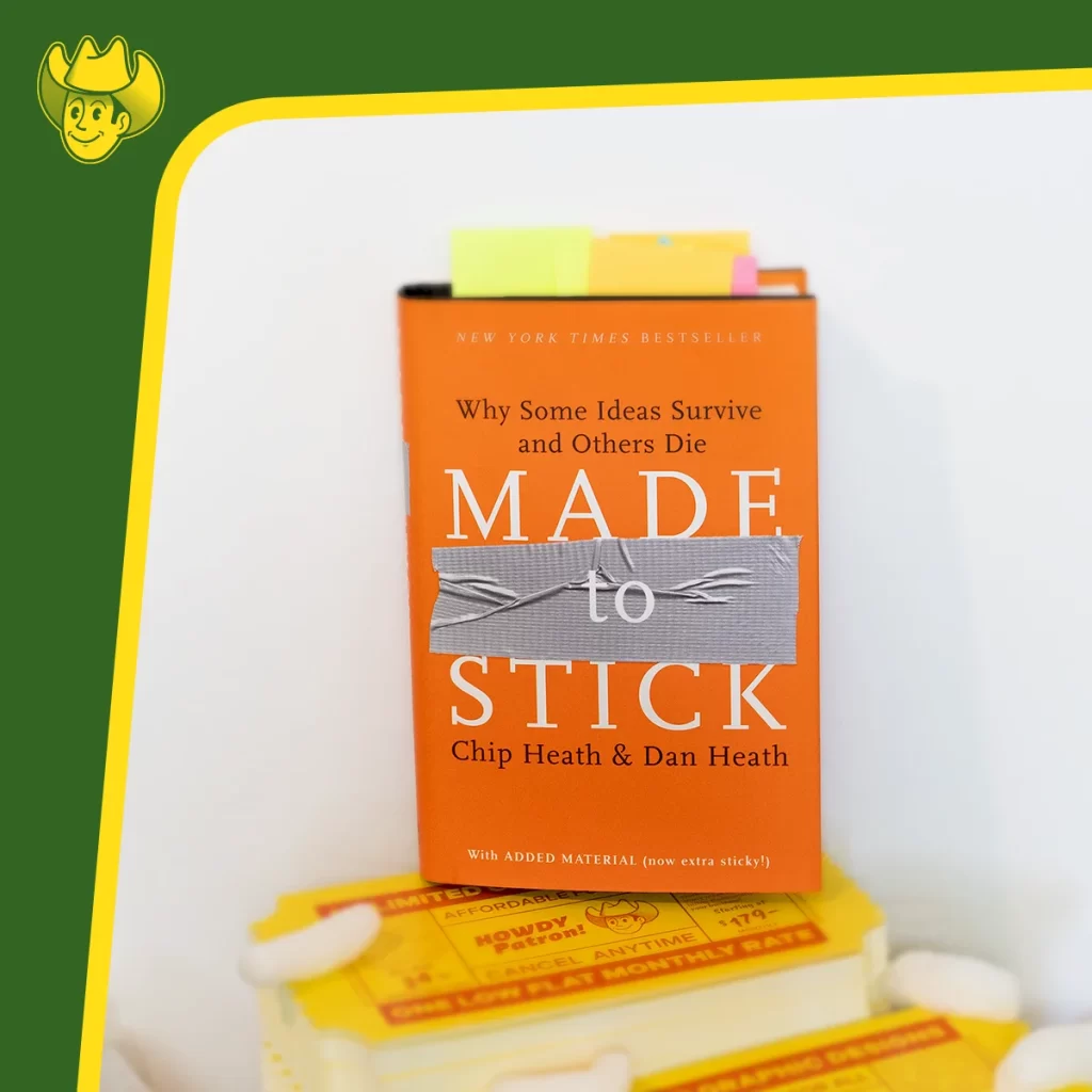
Made to Stick Summary
Folks, this book, Made to Stick, is ANY creative’s dream come true. Imagine gaining all the knowledge to have your work stand out from the crowd. What if there were just a few simple steps, almost a science if you will, to create memorable experiences, relationships, graphic designs, songs, art, music, marketing campaigns, and so on? The book Made to Stick by Chip Heath and Dan Heath lays out the steps, and we will go over the steps and how you can apply them to graphic design and marketing. This book is a must-read for graphic designers who want to take their work to the next level or for marketers who want to improve marketing tactics and make their ideas stick in the minds of their audience. This blog post will provide a comprehensive summary of this book and its key takeaways pertaining to graphic design and marketing.
Made to Stick is all about making ideas memorable also known as “sticky” which is a slang marketing term. The authors argue that six principles make an idea stick:
-
Simplicity
1.
-
Unexpectedness
2.
-
Concreteness
3.
-
Credibility
4.
-
Emotions
5.
-
Stories
6.
forming the acronym
S U C C E S s
SUCCESs in-depth in book Made to Stick

The first principle is simplicity. The authors argue that we need to find the core of our message and strip away anything that is not essential. Simplicity makes it easier for people to understand and remember our ideas. The second principle is unexpectedness. We must break the pattern and surprise our audience to grab their attention. The third principle is concreteness. We need concrete examples and vivid imagery to make our ideas more tangible.
The fourth principle is credibility. We need to ensure that our ideas are believable and supported by evidence. The fifth principle is emotions. We must tap into people’s emotions to make them care about our ideas. The sixth and final principle is stories. We must tell stories that illustrate our concepts and make them more relatable.
The book provides numerous examples of how these principles can be applied in different contexts. One example is the famous “Kidney Heist” urban legend. The authors show how this story sticks in people’s minds because it incorporates all six principles of SUCCESs. It is simple, unexpected, concrete, credible, emotional, and told as a story.
Another example is the “Commander’s Intent” technique used by the military. This technique ensures everyone understands a mission’s overall objective, even if the details change. This technique exemplifies how the simplicity principle can be applied in a complex context.
The book also provides a framework for creating sticky ideas. The authors suggest that we start with the audience and their needs. Then, we need to identify the core of our message and find ways to make it simple, unexpected, concrete, credible, emotional, and told as a story.
Sticky graphic design

The book Made to Stick by Chip Heath and Dan Heath is an excellent resource for graphic designers looking to create higher-caliber work. The book offers a comprehensive guide on how to make ideas stick and resonate with your audience. In this context, a graphic designer can apply this book’s principles to their graphic design work to create designs that look good but, most importantly, are memorable (effective).
A graphic designer who uses the SUCCESs principles will take their work a step further away from mediocrity, as they can help create designs that are not only beautiful but also convey a message that resonates with the audience. If you are a graphic designer reading this by now, you must know that technical skill and a beautiful design have nothing to do with getting a viewer’s attention and having them retain/ grasp the design intent.
Simplicity is critical when it comes to graphic design. It is essential to keep your design simple and easy to understand. The book suggests that one way to achieve this is to find the core of your message and strip away all unnecessary elements. This principle can be applied to graphic design by focusing on the essential elements of the design and removing any extreme elements that may distract from the message. Simplicity has been a design trend in vector art, layouts, and logos for the last two decades. So this one we have already had in the bag.
Unexpectedness is another principle that applies to a graphic design’s overall memorability. The book suggests that one can create memorable and sticky ideas by breaking patterns and norms. In graphic design, this is achievable by creating unexpected designs or having a unique twist that separates it from the rest. And out of all the SUCCESs, many designers and marketers often overlook this concept. They overlook it because they choose to play it safe.

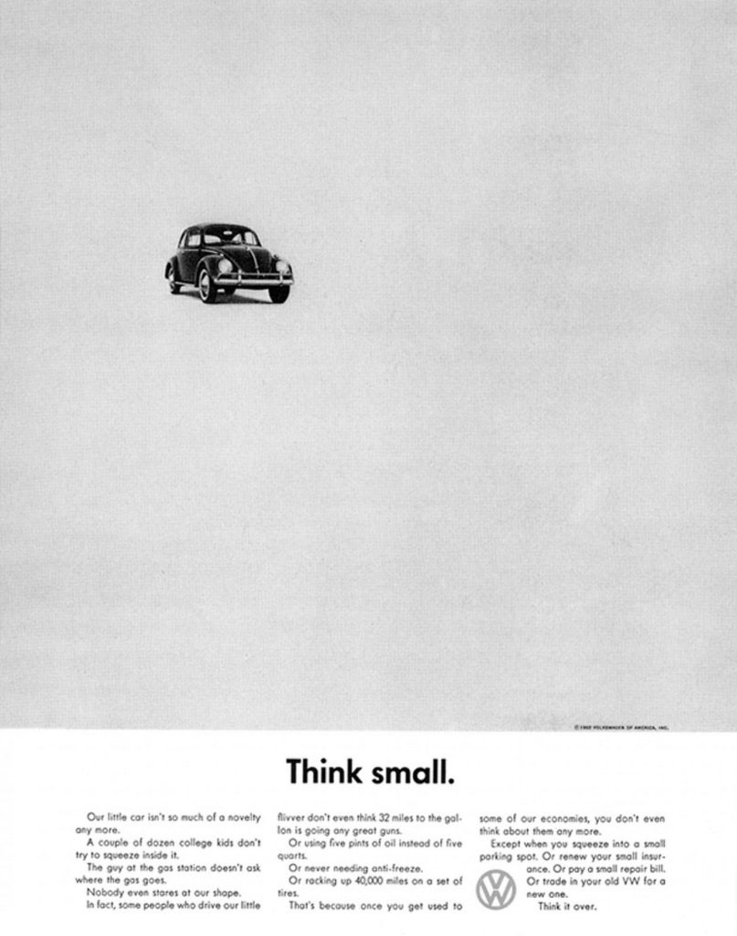
A great example of Unexpectedness is Volkswagen’s 1960s “Think Small” ad in which the graphic designer and copywriter both turned what was standard for a typical magazine layout (for the time) and turned a preconceived idea on its head.
Volkswagen nailed it! The 1960s was the era of utilizing several fonts, impressive illustrations, and claustrophobic designs. Literally, The designs were very busy with very little white space. Volkswagen’s ad did the complete opposite; it used one font, a generic black and white photo, utilized only a small portion of the available white space, and the copywriter used the words “Think Small.”… when has anybody advised another person to think small? Never. That made this unexpected, which is why it was a success. The ad was a show stopper and made it into graphic design and marketing history books as one of the most influential ads.
Concreteness is another principle that can be applied to graphic design. This can also apply to illustration and brand mascots as well. One can create more relatable and memorable designs by making abstract concepts more tangible. You can achieve this using concrete elements such as images and easily recognizable symbols.
Credibility is essential in creating designs that are convincing and trustworthy. The book suggests that one way to achieve this is by using statistics and facts to support your message. A Graphic designer can accomplish this by incorporating data and facts to reinforce the message.
Emotions are a powerful tool in creating designs that resonate with the audience. By evoking emotions, one can create designs that are memorable and impactful. In graphic design, emotions can be evoked using color, typography, and imagery to elicit a specific emotion.
Finally, stories are an effective way to make ideas stick. By telling stories, one can create designs that are not only memorable but also relatable. In graphic design, storytelling can be achieved by using imagery and typography to create a narrative that connects with the audience. However, when stories are involved in advertising, it is usually done as an overarching branding identity, not necessarily a graphic design that needs a story in the design itself.
In conclusion, the book Made to Stick by Chip Heath and Dan Heath is an excellent resource for graphic designers looking to create higher-caliber work. By incorporating the book’s principles of simplicity, unexpectedness, concreteness, credibility, emotions, and storytelling, graphic designers can create designs that are not only aesthetically pleasing but also communicate effectively with the audience.
Sticky marketing

Chip Heath and Dan Heath’s book Made to Stick is not just applicable to graphic design, but also to marketing in general. The principles they outline can help marketers create campaigns that are more memorable and impactful.
One of the key principles outlined in Made to Stick is the power of simplicity. This is particularly relevant for marketing campaigns, as it’s easy to get carried away with complex messaging that may look impressive, but ultimately fails to communicate the intended message effectively. By focusing on simplicity and stripping away unnecessary elements, marketers can create campaigns that are more memorable and easy to understand.
Another important principle outlined in the book is the importance of making an emotional connection with the viewer. This is especially important in marketing, as the goal is often to elicit a specific emotional response from the viewer. Whether it’s creating a sense of excitement for a new product or service, or evoking a feeling of nostalgia in a branding campaign, marketers who can tap into the emotional needs of their audience are more likely to create campaigns that resonate.
The book also emphasizes the importance of using concrete examples to help reinforce the message being communicated. In marketing, this can be achieved through the use of case studies, testimonials, and other examples that help to illustrate the key points being made. By using concrete examples, marketers can create campaigns that are more relatable and easier for viewers to understand.
Finally, Made to Stick emphasizes the importance of telling a story. This is particularly relevant for marketing campaigns, as storytelling is often an integral part of branding and advertising campaigns. By creating a compelling narrative that resonates with viewers, marketers can create campaigns that are not only memorable, but also more likely to inspire action.
Overall, the principles outlined in Made to Stick can be incredibly valuable for marketers looking to create campaigns that are more memorable and impactful. By focusing on simplicity, emotional connection, concrete examples, and storytelling, marketers can create campaigns that not only look great, but also stick with the viewer long after they’ve seen it.
And here's the final word
Made to Stick is a valuable resource for anyone who wants to improve their communication skills. The book provides a clear framework for creating sticky ideas and illustrates how these principles can be applied in different contexts. By applying the principles of SUCCESs, we can make our ideas more memorable and effective.

