
Design steps to make your flag worthy
Designing a flag is an exciting and creative process that can be used to represent a group, organization, or even a personal identity. Flags are symbols that convey meaning and evoke emotions, so it’s important to consider each design element carefully. If you want to create your own flag, here are some steps to guide you.
Step 1: Define the Purpose and Identity
Before you start designing your flag, knowing what you want it to represent is essential. Consider the group or organization it will represent or the personal identity you wish to convey. Research the symbolism and colors associated with the essence or group to ensure your design is appropriate and meaningful. Decide if you are after a traditional, more conservative approach to the design or a more unorthodox version if that is not important to you.
Quick tip: a more unorthodox design will attract more attention. However, if your design does not positively capture a viewer’s attention, the flag design can turn people away from your organization or cause… and nobody in your organization wants that, right?
Step 2: Choose Colors

Colors are an essential part of any flag design. They can represent different emotions, ideas, and values, so it’s necessary to choose them carefully. Consider the meaning and symbolism of each color and how they relate to the purpose and identity of the flag.
Colors and emotion

We will explore color in depth and the emotions they instill in a viewer. When people see primary colors like red, blue, and yellow, they often experience different emotions. Red is known to evoke feelings of passion, energy, and excitement. It can also symbolize danger or warning. Blue, however, is associated with trust, tranquility, and stability. It can also represent sadness or melancholy. Yellow is linked to happiness, optimism, and warmth. It can also convey caution or warning. Overall, the emotions that primary colors instill in people can vary based on personal experiences and cultural influences.
Secondary colors are created by mixing primary colors. Orange, for example, is a combination of red and yellow, while green is a blend of blue and yellow. When people see these colors, they often experience unique emotions. Orange is known to evoke feelings of warmth, enthusiasm, and creativity. It can also represent caution or warning, similar to yellow. Green, on the other hand, is associated with growth, harmony, and balance. It can also symbolize envy or jealousy.
Purple, created by mixing blue and red, is another secondary color that can elicit powerful emotions in viewers. It is often linked to royalty, luxury, and creativity. It can also represent mystery or spirituality. In general, the feelings that secondary colors instill in people can be just as varied and complex as those of primary colors. Each color’s specific emotions can depend on various factors, including personal associations and cultural influences.
Step 3: Select Symbols and Shapes
Symbols and shapes are an essential part of any flag design. They can represent different ideas, values, or aspects of identity. Think about symbols and shapes that are meaningful to the group or identity you are describing. Keeping the design simple and easy to recognize is important, so avoid using too many symbols or complex shapes. Examples of simple shapes include circles, squares, triangles, and rectangles. These shapes form the building blocks of more complex figures and are essential in studying geometry. Simple shapes, such as road signs, logos, and packaging designs, are also commonly used in everyday life. Overall, simple shapes are fundamental elements in design and art, so keeping it simple is best.
Know when your shapes are starting to get too complex

When it comes to design, simplicity is often the key to success. Complex shapes may seem appealing at first glance, but they can quickly become overwhelming and distract from the overall message of a design piece. A general rule of thumb in graphic design is to avoid complex shapes because they can confuse viewers and detract from the intended message.
Additionally, complex shapes can be difficult to reproduce accurately and consistently. This can lead to issues with printing, scaling, and other production processes. For example, if you ever need your flag design silk screened on a cloth, a complex shape can create anomalies or paint bleeds in tight areas. Also, complex shapes make it much more challenging to lay the film over a screen and “burn ” it. This has to do with too much data; complex shapes contain more data, more data makes it very difficult to remember, especially when people are busy focusing on their own lives. Using basic shapes makes a design more memorable or “sticky,” as Chip Heath & Dan Heath would say in their book “Made to Stick.” Learn more about simplistic design principles and how they are much more memorable (sticky) and effective in delivering the right message.
Using simple shapes and designs, graphic designers can ensure that their work is easy to reproduce and maintain, making it more accessible to a broader range of viewers and easier to remember. In short, the benefits of simplicity in design far outweigh any potential benefits of using complex shapes.
Step 4: Design the Layout
Now that you have selected the colors, symbols, and shapes, it’s time to design the layout. Consider the location of elements and how they work together to make a cohesive design. It’s important to keep the design balanced and visually appealing. If this design will go to print, we included some helpful and technical steps with images to guide you through the process.
Flag Design: Document setup and US standard flag aspect ratio
If this flag will be printed, create the document at 300 DPI in Photoshop. Ideally, you want to think of the aspect ratio first. Standard US flags are at a 3:5 aspect ratio—most flags are designed with this dimension. To set up an aspect ratio in Photoshop, click on your Crop tool and input the aspect ratio 3:5. You can adjust the feet and height to your requirements later. As of now, you’ll want to follow the steps for the correct document setup before beginning your design.
<pic>
Photoshop document Setup &
general steps in your process
- Create a new document with the desired dimensions for the flag.
- Set the resolution to at least 300 pixels per inch to ensure high-quality printing.

- As mentioned above, now is the time to set your aspect ratio before proceeding further.

- Lastly, you will want to utilize your guides heavily in a project such as designing a flag. Most flags are well known for having exceptional linear and accurate placements of shapes and images.


- In this last step, add a .5-inch bleed. Since this is relatively large in size, a .5-inch bleed suits it well.

You’re all set to start designing.
Step 5: Get Feedback
Before finalizing the design, it is essential to get feedback from others. Share your design with friends, family, or members of the group or organization you are designing it for. Consider their feedback and make any necessary revisions to the design.
-
What specific areas of the design stand out to you positively or negatively?
1.
-
Are there any elements of the design that could be improved?
2.
-
What feeling do you get from the design?
3.
-
How could the design be made more effective or appealing to you?
4.
-
Can you provide any specific examples or suggestions for improvement?
5.
You can follow the feedback as much as you like and make changes accordingly.
Step 6: Finalize the Design
Now that you have made any necessary revisions, it’s time to finalize the design. Make sure that all of the elements work together to create a cohesive and meaningful design. Consider the size and format of the flag to ensure that it will not be printed incorrectly, as this could be an expensive mistake. Again, make sure your aspect ratio is 3:5 if you want the standard flag look, and make sure your canvas size in inches/ feet is accurately setup with 300 DPI to get the best resolution possible.
Communicate with your print shop to get all of that information right.
Saving the Photoshop document for print
- Now that your design is complete, head up to the top left corner and click File>Save As

- Go down to Save as type:>Photoshop PDF>Save

- At the top, go to Adobe PDF Preset and select [High Quality Print]

- Lastly, click Save PDF

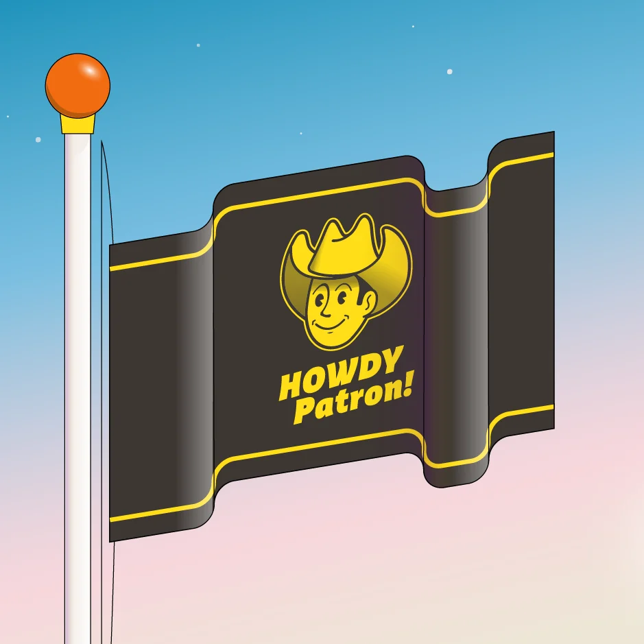
If you would like a professional graphic designer’s review of your flag, reach out to Howdy Patron, as their professional designers can offer you some practical advice if not design your organization’s flag for you.
What material should I print my flag on?
There is no correct answer here. But we can provide the properties of the three most common cloths used in flag printing.
- Nylon: A popular choice for outdoor residential use. It’s strong, flies well, and resists mildew and fading.
- Polyester: A popular choice for large flags. It’s durable, heavier, and more expensive than nylon.
- Cotton: A popular choice for indoor flags. It has a striking visual appearance, a soft feel, and a beautiful drape.
Conclusion
Designing a flag is a rewarding and creative process that can be used to represent a group, organization, or personal identity. Following these steps, you can create a meaningful and visually appealing design that will stand the test of time.
